FUTR - Accessible and Sustainable Banking for Everyone
Overview
To design a bank brand that appealed to and fufiled the needs of 16-25 year olds.
The Problem
Banks don’t often consider the needs of younger people, making banking confusing and frustrating as users become financially independent.
Target Audience
Young People aged from 16-25 with a focus on university students and the financial challenges they face.
My Role
All aspects of the design process from research and discovery to final prototype.
Requirements
To create brand guidelines, an app and a landing page for my new banking brand.
Project Length
12 weeks
Research & Discovery
I started by completing desk research into the banking options available to young people, and found two main options traditional high street banks (e.g. Santander, HSBC) or digital only banks (e.g. Monzo, Revolut). I then conducted a survey with members of my target audience to discover their attitudes and opinions to these differing banking options.
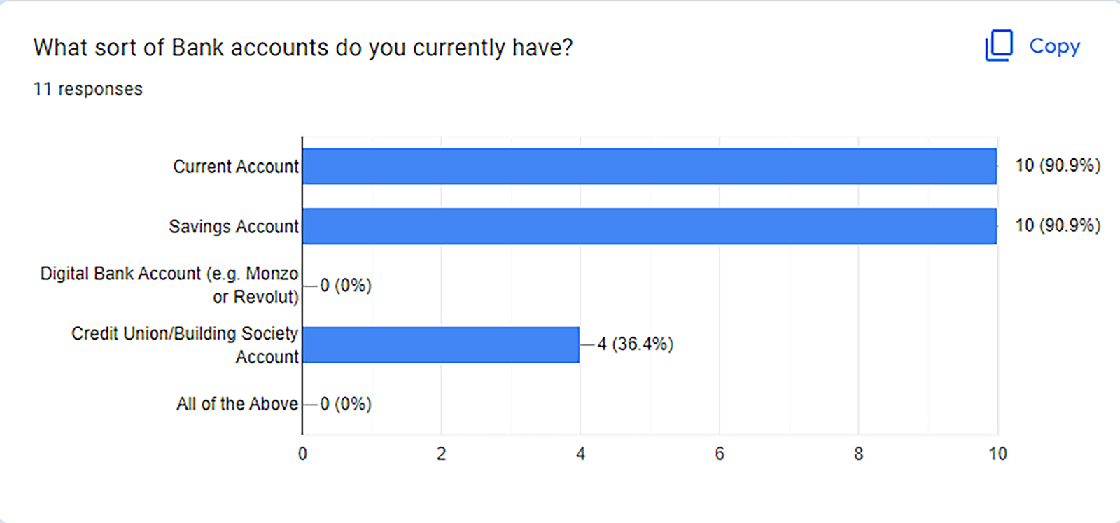
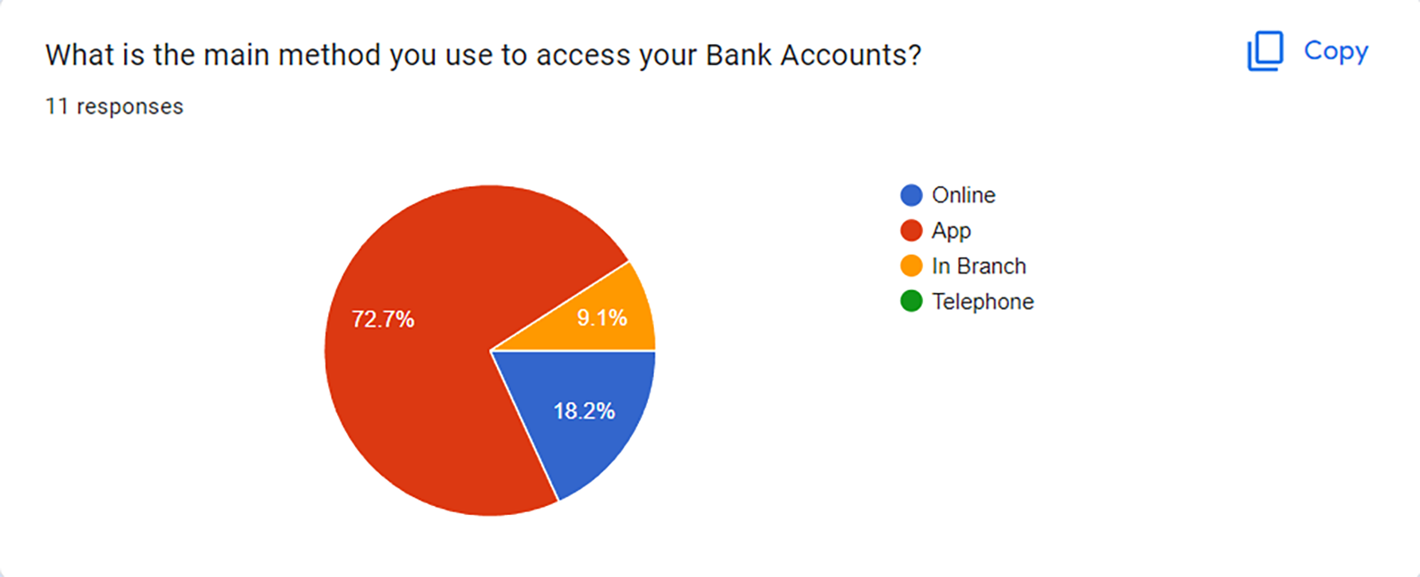
This research showed that while most young people used online and app based banking services, none of my survey group currently used a digital only bank. In-branch services were used by a percentage of my survey group as well. This information was clear, that while my brand could be digitally focused it could not only be digital.
Brand Values
To create a brand I needed to develop some core values, these would provide the framework for which decisions could be made on the feel and direction of the brand. The values for my brand were:
- Dream
- Secure
- Flexible
- Innovative
- Sustainable
Brand Name
Now I had my brand values I could concentrate on the name for my brand, I completed lots of research into what worked well and what didn’t in terms of naming a brand. I then sat down and started to mind map all the name possibilities I could think of. This led me to a shortlist of five possibilities:
- FUTR
- Money Locker
- Flexibank
- Focus
- Fitted
I was then able to show these names to a group of my target audience who told me what name resonated most with them.
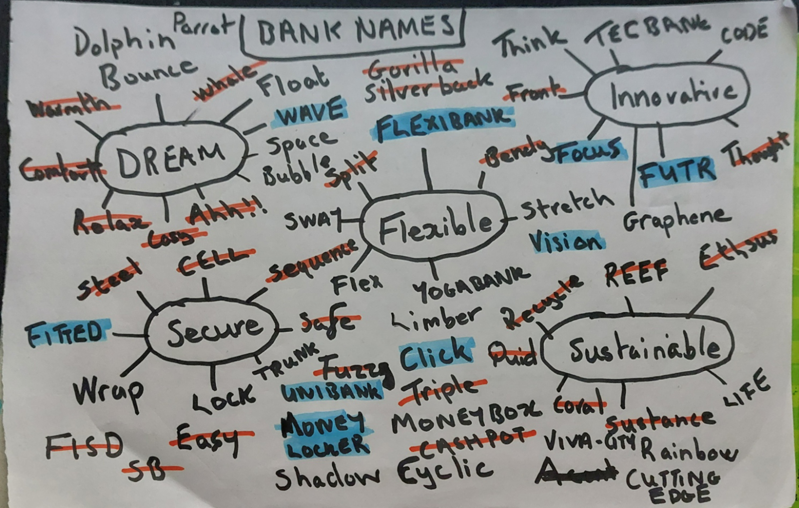
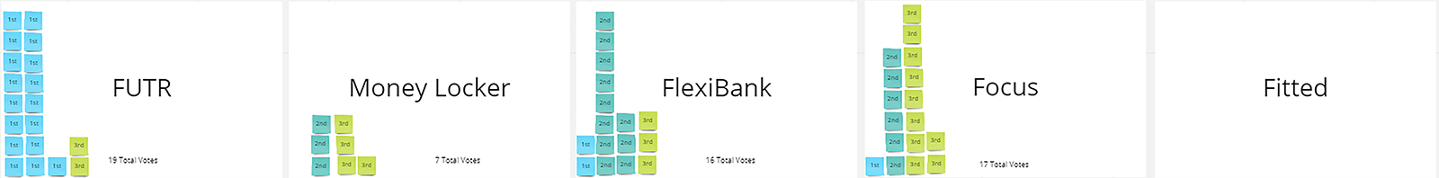
These two tasks led me to my brand name FUTR.
Brand Guidelines
Now I had a my core brand values and my brand name I was ready to research and make the other key decisions that my brand needed. These included:
- Mission Statement
- Brand Story
- Typography
- Tone of Voice
- Brand Mark
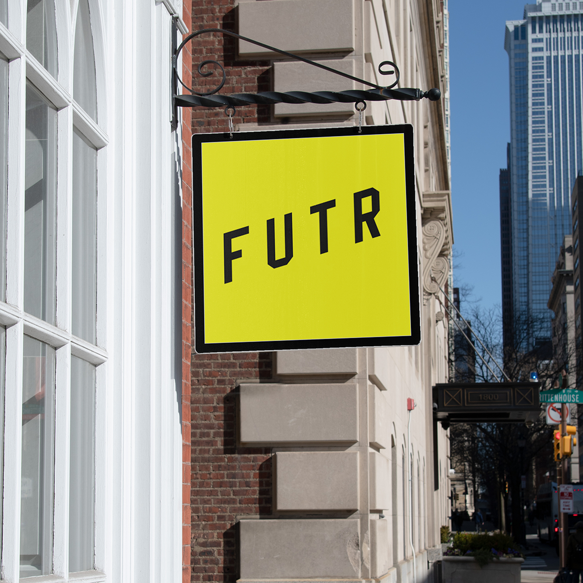
- Colour Palette
- Web Domain
From these I was able to create a brand style tile, to show what my branding decisions would look like when used in the real world.
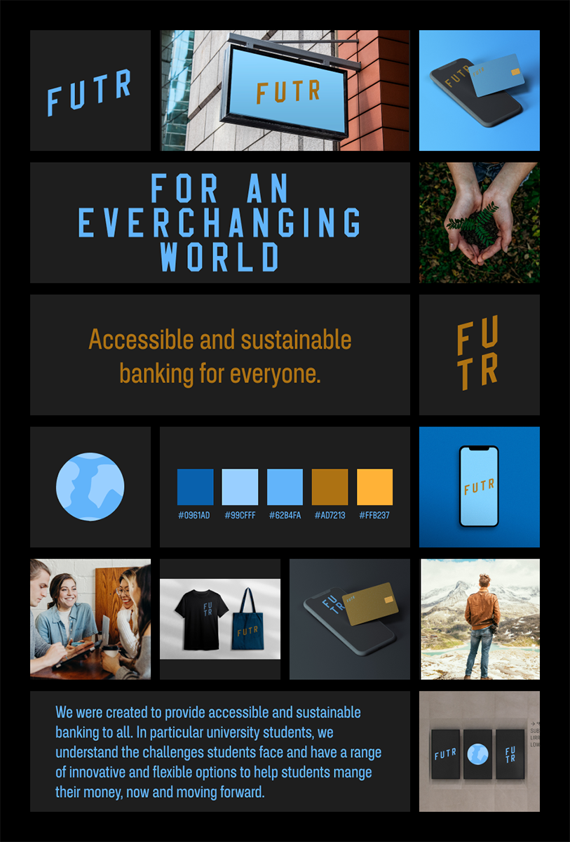
This was created in time for a design critique of my brand’s progress. While my brand was working the colour palette was not, and this was clear from the critique feedback, which unanimously supported a change in colour palette. I needed colours that unambiguously gave meaning to my brand values especially innovation and flexibility. From this discussion I was able to go back to my research have a think and develop a new colour palette which I applied to the style tile above for comparison.
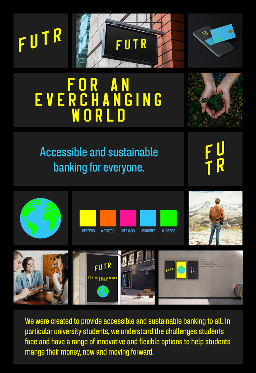
Now I had a colour palette that reflected my brand I could pull together all the aspects of my brand into a singular brand guidelines document.
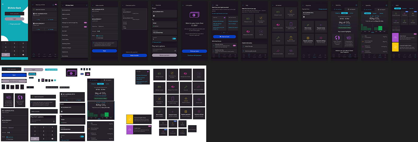
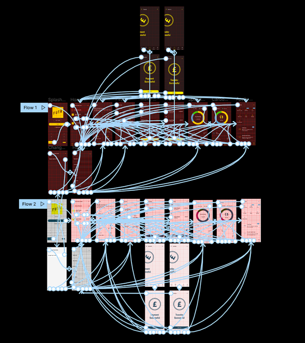
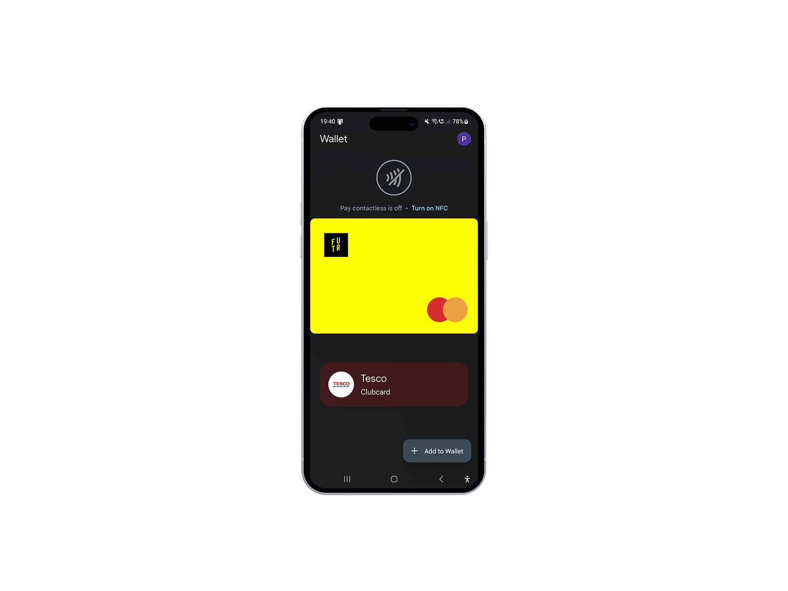
FUTR Bank App
To create my banking app I started by completing a full interface inventory of my own banking app from Ulster Bank. While the app was good, it did have room for improvement so using the design as a starting point, I made improvements and rebranded the app for FUTR.
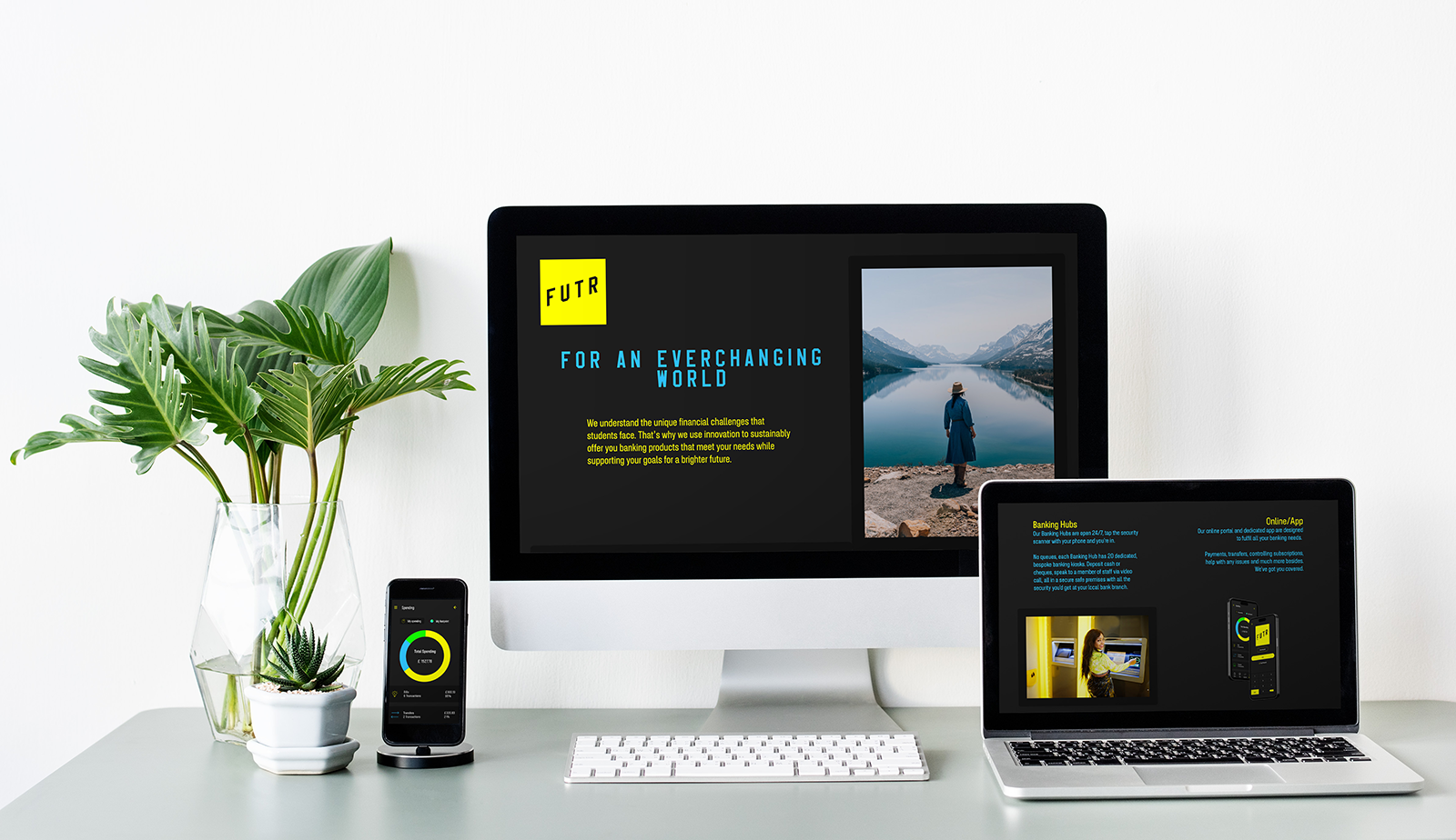
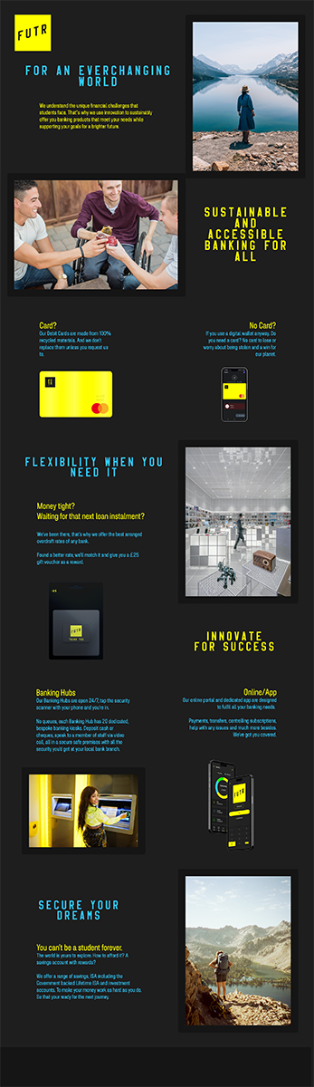
Bank Landing Page
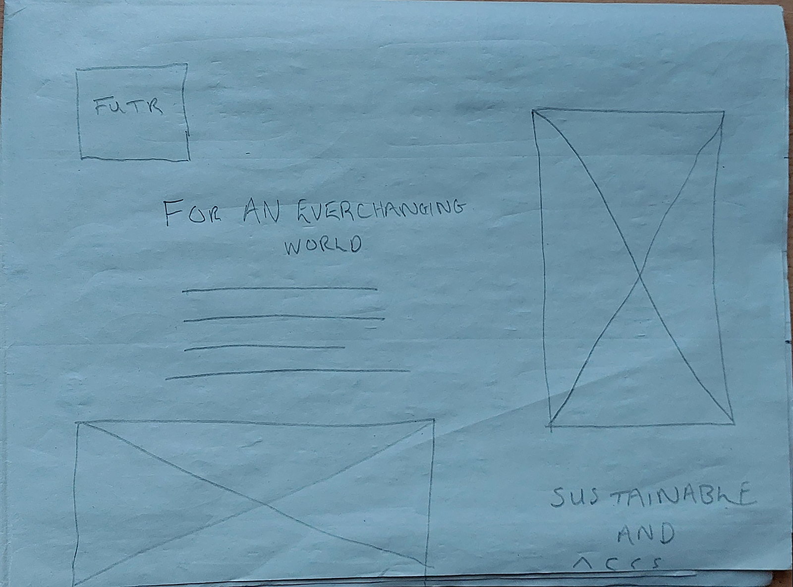
The final product that I needed to develop for the FUTR brand was a landing page, as a first point of online contact for my bank brand, it was a key product to get right.
I started by completing a Crazy 8s exercise to create a lot of different possible designs quickly.
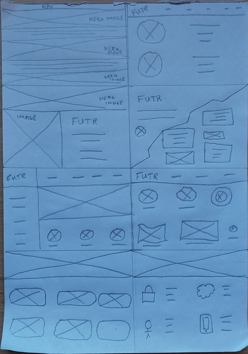
Now I had ideas I was able to select those that worked from those that didn’t and proceed through further sketches and mockups until I arrived at my final design.
Final Completed Projects
Brand Guidelines:
FUTR App
FUTR Landing Page
Outcome
As this project was the main deliverable for one of the modules of my university degree course, the main outcome was the mark I received. I received a First for this module and was extremely pleased with this.
Below I have included some of the feedback I received for this project:
“Guidelines document contains good rationales for your design choices and provides a good overview of the identity.”
“App design shows good consideration of scale and sizing and applies your brand well. Prototype is very well produced with multiple screens and features shown. Commendable use of micro animations, colour and icons.”
“Overall a very good submission with excellent research and dedication shown.”
Lessons
This project was a huge learning curve for me, I had never taken on a branding project of any kind before, much less developing a new brand from scratch. This is why I dedicated so much time to my research and discovery. I had a lot to learn and experiment with before I could start shaping the final brand.
The main lesson this project provided was the importance of user research and seeking continued user feedback throughout the project. This was made clear to me when I was struggling to decide between some different brandmark possibilities. I decided to conduct a very quick A/B test with a selection of my target audience and within a few hours I had clear data to work with, which made my decision an easy task. I know I will definitely be seeking more feedback throughout my projects moving forward, from my peers, other designers and intended users. Feedback helped to improve this project immeasurably and is the main lesson I take forward from this project.
For a much deeper insight into this project visit my Notion blog.