FallPal - Fall Detection and reaction from your Smartwatch
Overview
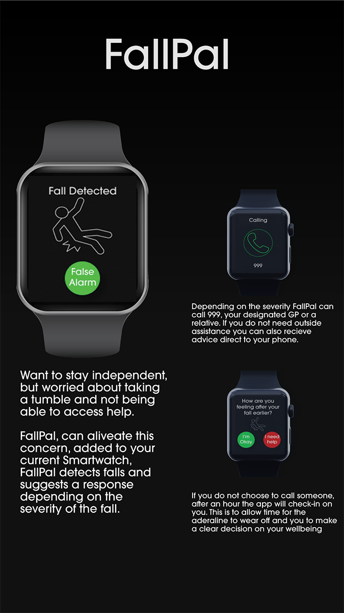
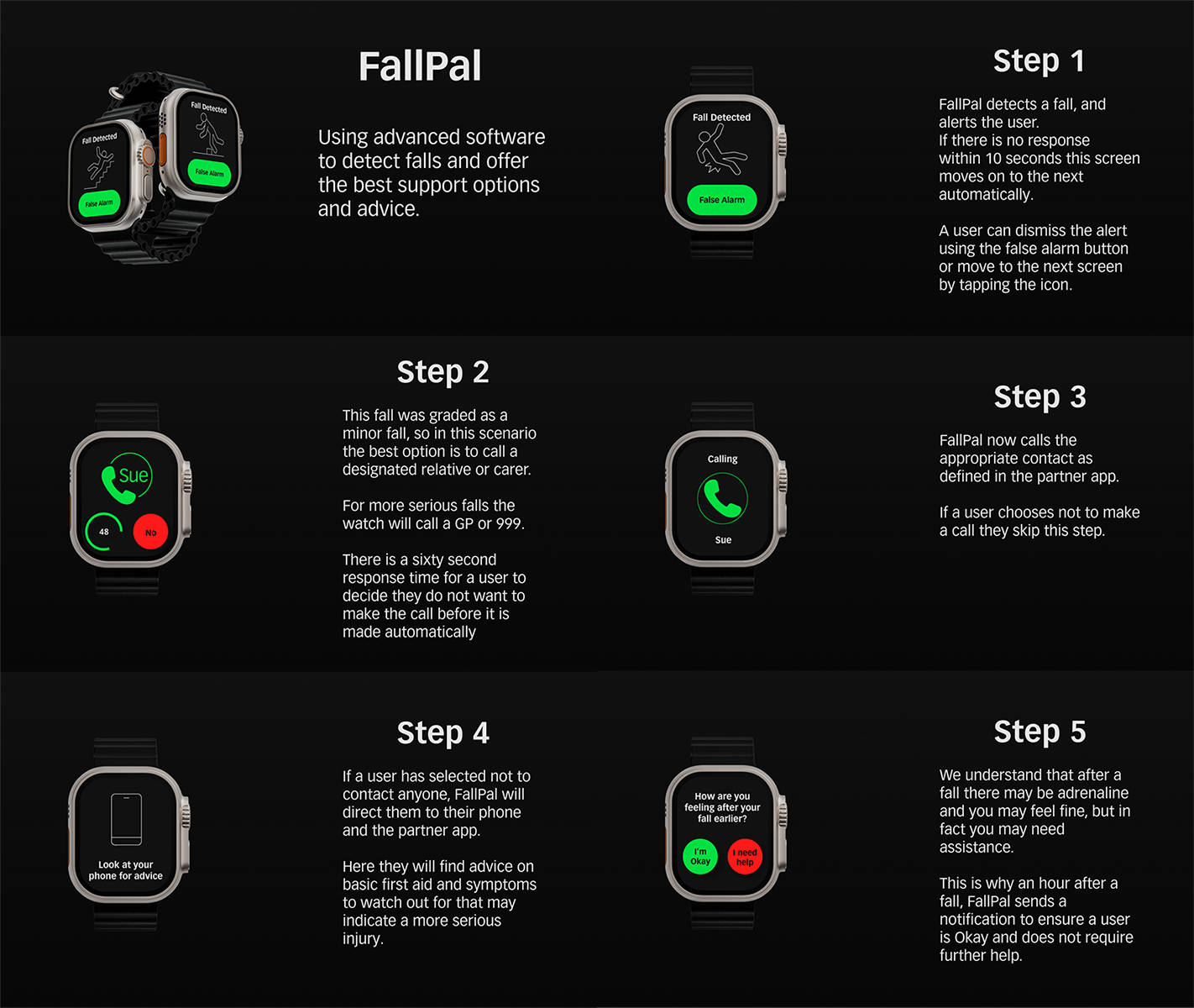
A fall detection app, specifically designed for smartwatches. Designed with the needs of older users front of mind. Using the smartwatch's accelerometer and gyrometer along with sophisticated software to allow falls to be graded and an appropriate response taken.
The Problem
Older people want to remain independent and be free to continue their lives as they see fit. However as people get older the risk of trips and falls increases. This causes worry and concern for both the person themselves and their loved ones.
Users and Audience
Older people especially those who live alone.
My Role
All aspects of the design process from research and discovery to final prototype.
Requirements
To design and create high fidelity mockups of a Smartwatch App
Project Length
3 Weeks
Research & Discovery
As this was a short project, I needed to hit the ground running. To this end I started this project by ideating potential smartwatch app ideas before going on to research the ones I believed to be the best.
To ideate, I used the mind mapping technique to come up with a wide range of possible projects.
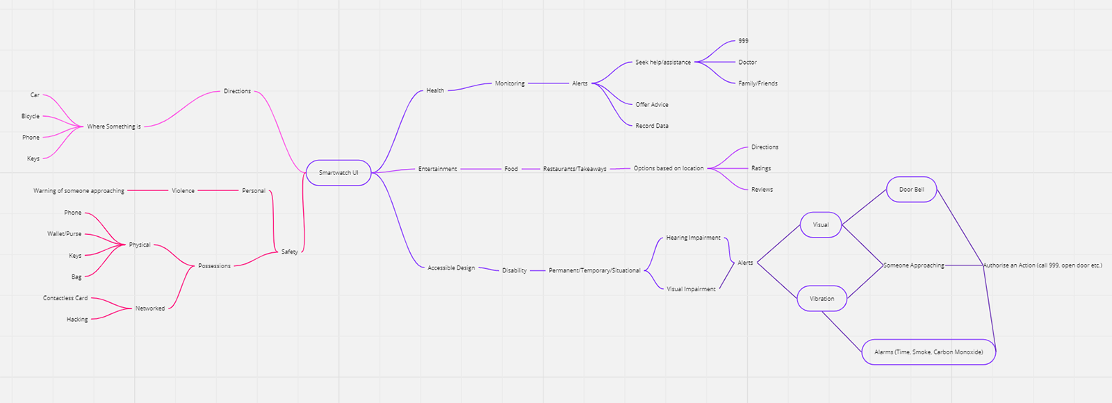
I used this mind map to come up with potential ideas, which I then sketched to see if my ideas would be possible on the reduced real estate offered by a smartwatch screen. The idea that worked best was a fall detection app specifically aimed at older people and their design needs.
From here I developed user and job stories for my fall detection app to help me to decide what my app needed to deliver my users.
Here are my user stories:
- As an older person living independently, I want to have a device that will detect if I fall. So that I can feel confident going about my daily life.
- As a carer of an elderly relative,I want to know they can contact me easily if anything happens, So I can have peace of mind.
And my job stories:
- When I have a fall, I want to have an easy way to contact the correct person/people. So I can get the help I need.
- When my smartwatch detects a fall, I want to be able to dismiss a false alarm, So I don’t alarm anyone or waste healthcare resources.
Now that I had a strong idea to work with, I was now able to target my research towards my audience and look at similar products already available.
I started by conducting a competitor analysis looking at both smartwatch specific apps as well as standalone fall detection solutions. It was interesting to note there was a wide range of different systems available all with benefits, but all had areas which I could improve on. There was definitely room in the market for the product I was developing.
Confident in my idea, I followed up by researching good design for both smartwatches and older people, as this was my first foray into designing specifically for either. This led me to find a number of design tips to ensure my design would work on my intended platform and for my intended audience.
Here is a summary of what I discovered for smartwatch design:- Design for glanceability, make all information easy to take in at a glance.
- Make interactions simple and quick, one call to action per screen is best.
- Allow the design to work independently of a smartphone, but a connected device can be useful for further information and longer interactions.
- Keep watch content relevant, only show what the user needs to know at that time.
- Use non-visual interactions as well, such as voice commands.
- Keep it simple, space is limited, time is limited, make sure the user gets what they need and can react to it easily.
And for older people:
- Use increased Colour Contrast.
- Avoid using Blue for interactive elements.
- Make Text bigger at least 16pt and make it user adjustable of possible.
- Use Icon Labels
- Make buttons and interface elements larger than the 44x44px suggested in Apple’s Human Interface Guidelines
- Allow for greater time intervals in interactions (e.g before an inactivity warning)
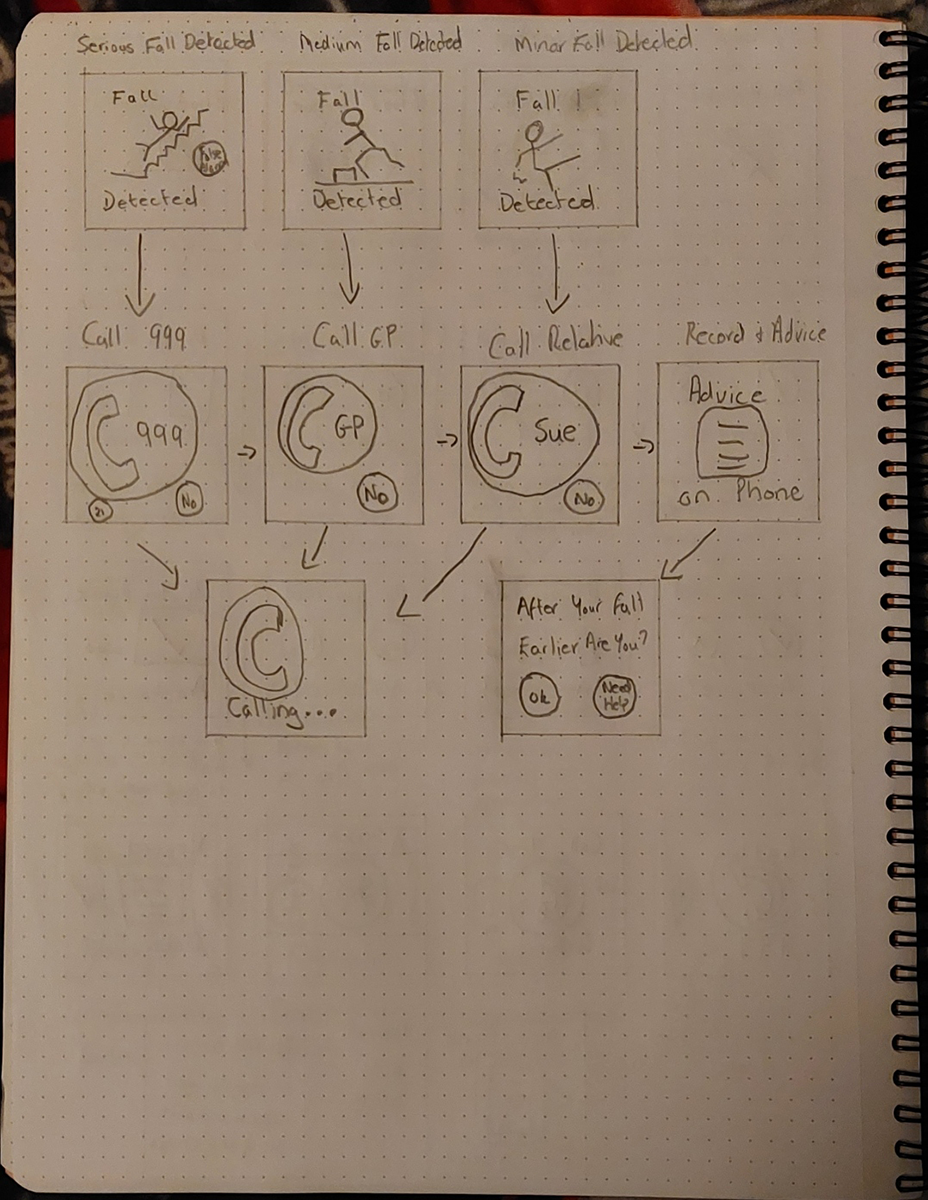
Sketches
I took time to sketch a number of screens as well as variants of those screens to see which fitted the needs of my user best.
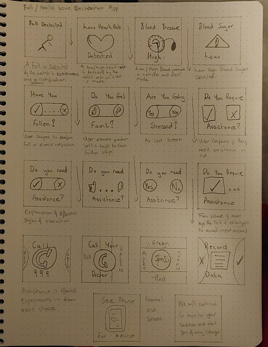
At this stage I was still looking at combining fall detection with other health monitoring technology, that could alert the user to any issues. However, due to the short time scale available for this app, I decided to concentrate on the fall detection element as I could always add extra functionality at a later date. This would align well with the practice of releasing app updates with extra features.
Low-Fidelity Mockups
With my sketches complete, I was still unsure of the best way for my users to interact with my app, should I have buttons to tap? Or use swipe interactions? To work this out I decided to create some low-fidelity mockups in Figma, to visualise the different options and use these to have discussions with others to help me make my decision.
I showed these low-fidelity mockups to a number of different people and most felt that swipe interactions on a small screen such as a smartwatch may be challenging. This was especially true for my target audience who may not be as used to swipe interactions as younger generations. I also considered that people using my app would have just suffered a fall and therefore may be feeling the after effects of that fall. This made it clear to me that simplicity and easy interaction was very important. My decision was to use clear, easy to use buttons as this was the best solution for my users.
Final Sketches, User Flow and Screens required
I now had made all the decisions through thorough research and discussion. To create a user flow for my app from fall detection through to getting the correct help or additional monitoring, I used a Miro board to visualise the user flow.
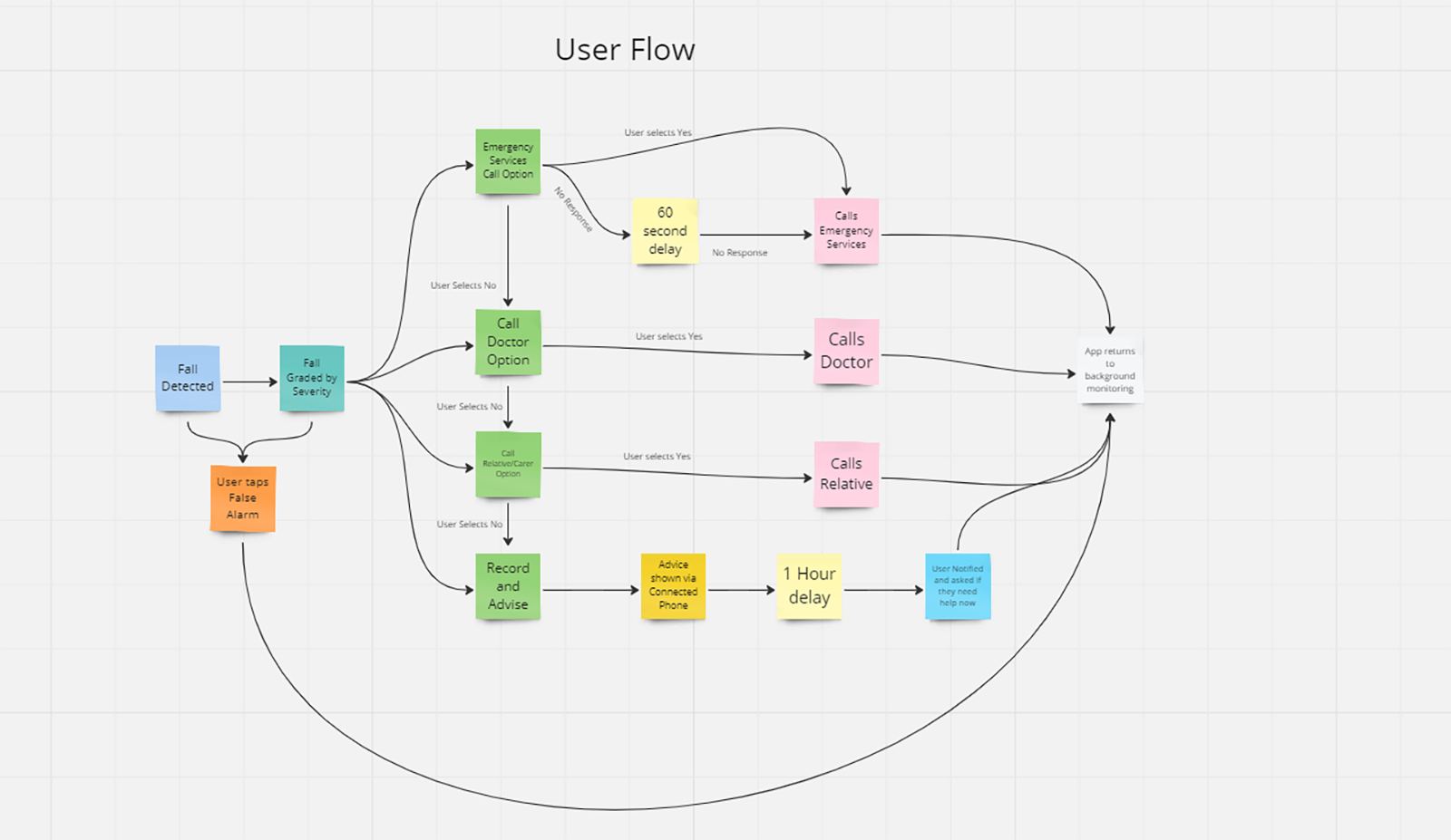
From this user flow, I was able to list all the screens I needed to create:
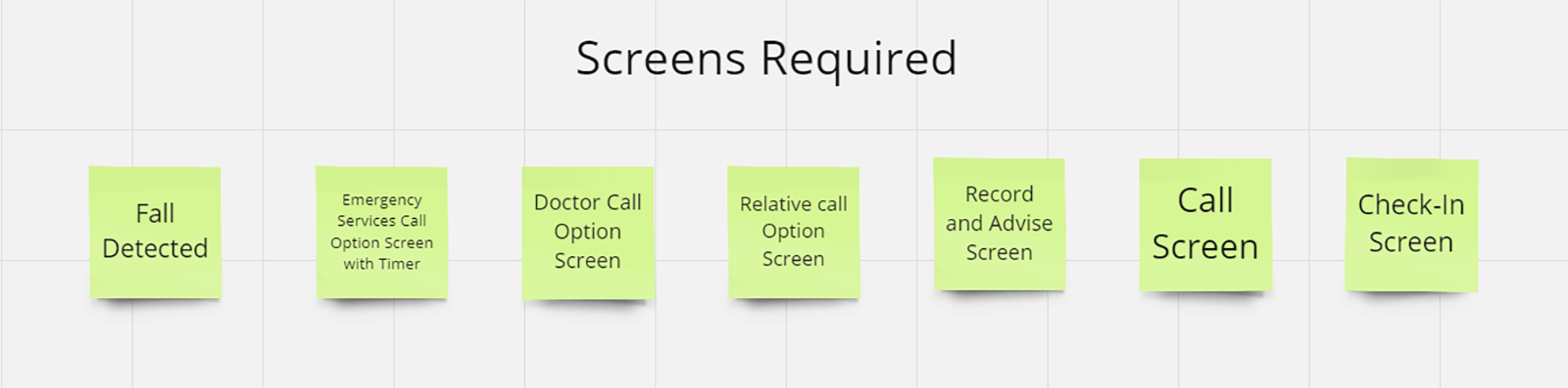
I decided to go back to paper and create a final set of sketches for these screens, these would act as my guide as I moved to create high-fidelity mockups using Figma.
App Brand and Design Decisions
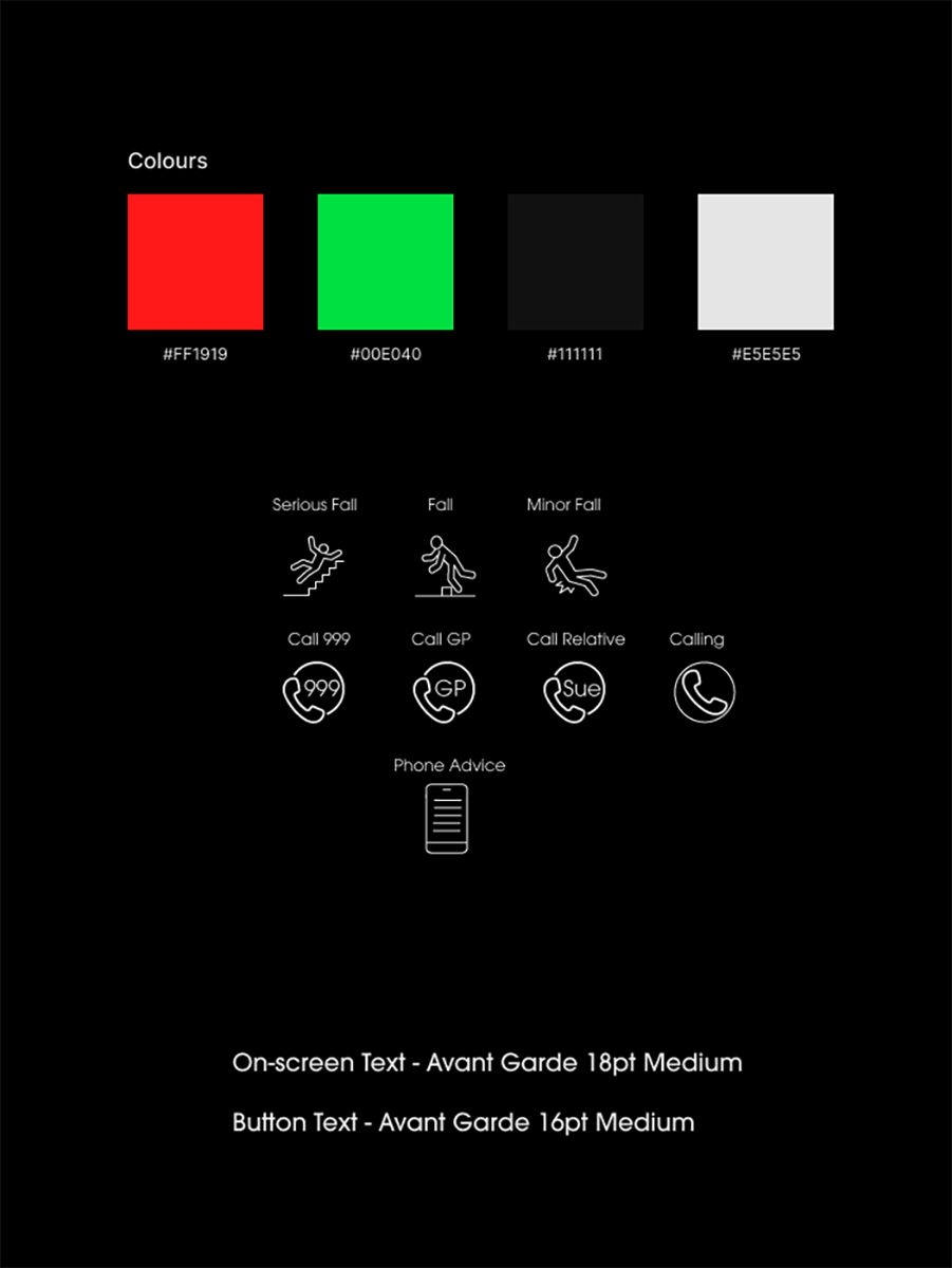
To finalise my app design from this stage I needed to create a brand for my app, this required a name, a colour palette and typography. I used my previous research to help me make these decisions.
I wanted to give the app to have the character of a caring friend, someone a user could trust and not something that was taking away any independence or privacy.
I came up with several words that I felt were appropriate for this and then looked at combining them into a catchy, simple name.
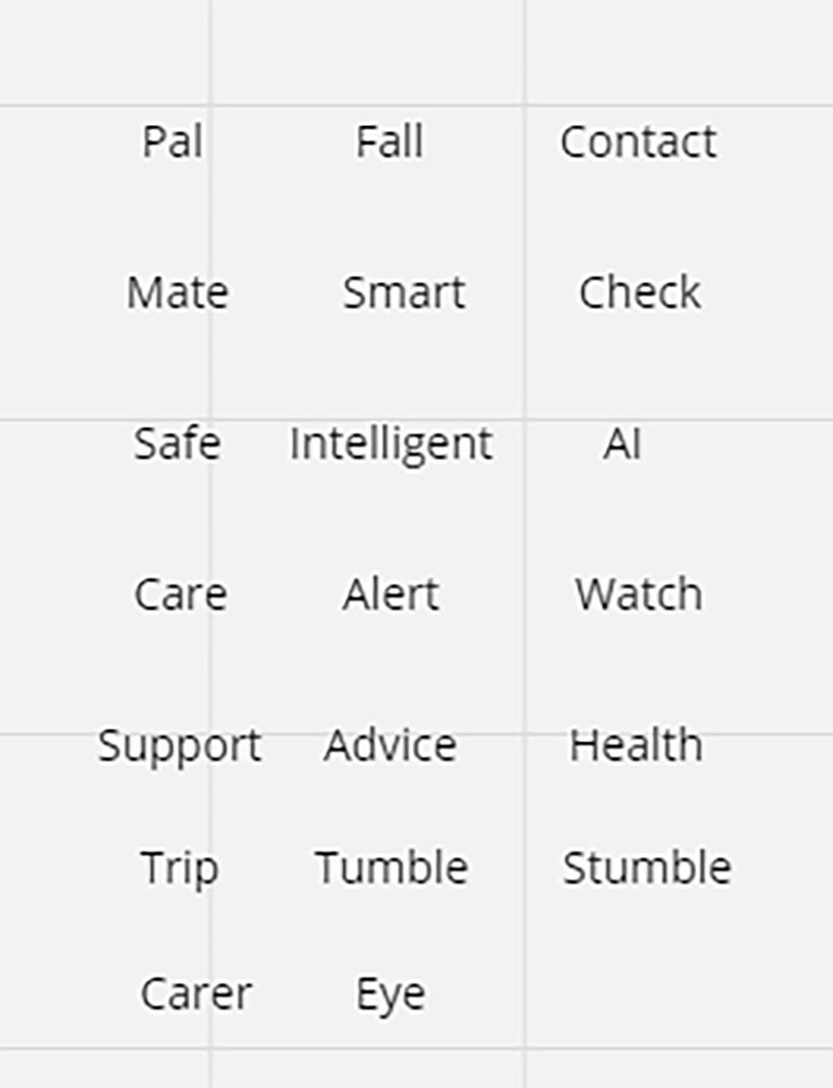
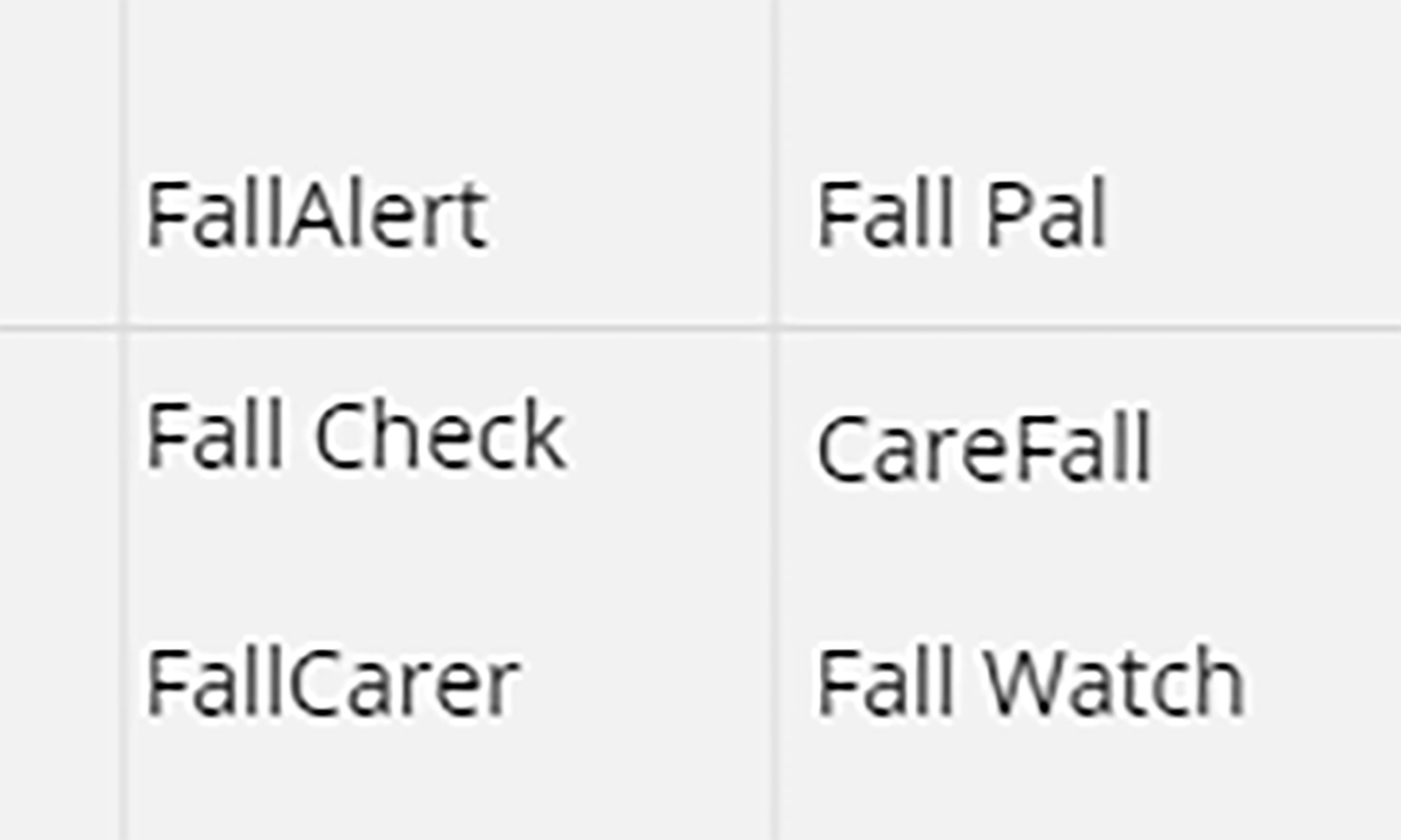
I decided to go with FallPal (I removed the space) as it was the name that matched the values and characteristics of the app.
I was also able to find suitable colours, typography and icons for my app, so I could start developing my final mockups.
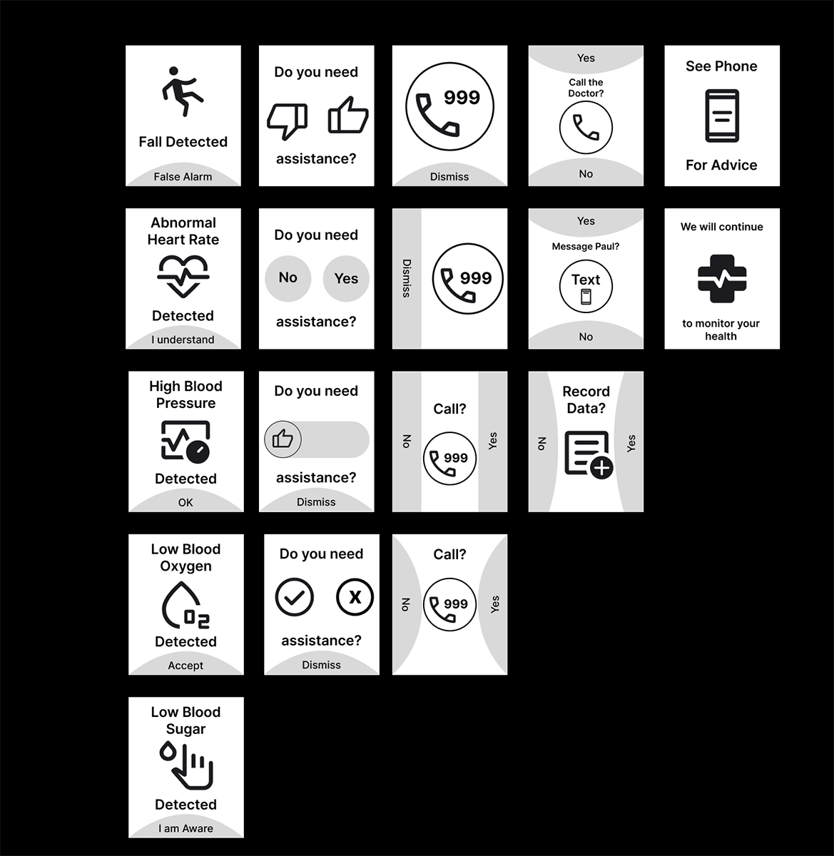
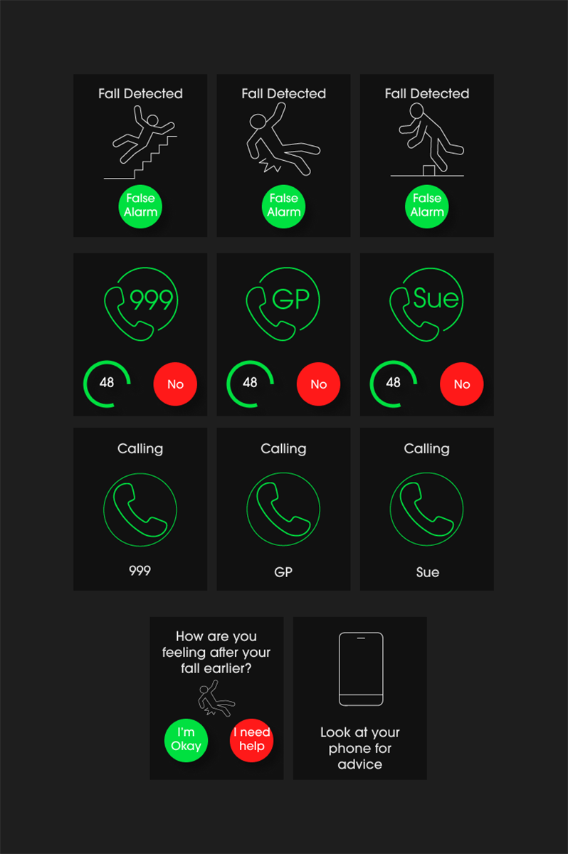
This left me with my final mockup screens:
Design Critique
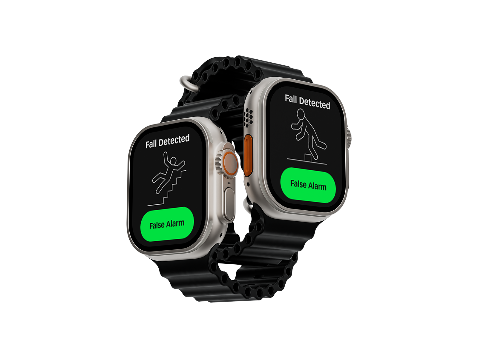
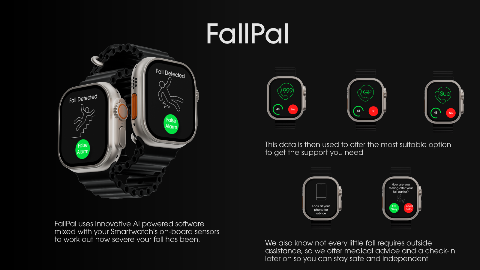
While I had my finished screens, I needed to turn them into full mockups by placing them inside a device frame, as well as creating assets that showed off my idea and what it was designed to achieve.
Above are the assets I put forward for the design critique, and as soon as I saw them on the big screen I knew I had made a massive error, the colour contrast of the white text on both the green and red buttons was too low. This was picked up immediately during the critique and I was really unhappy with myself, making such a basic error.
Other feedback was that the text weight was too light, the screen I had designed to check-in on users again after their fall didn’t need an icon and that I had space to make the buttons larger again to make things even easier for users.
I took this advice onboard as it was fair and I felt it would improve my design. I always feel that design critiques are a hugely important part of the design process. Getting more eyes on a project always brings different perspectives and leads to better final products.
Final Product
Using the design critique advice to improve my design I was able to create a final product I was very happy with and met the needs of my users I had set out earlier in my user and job stories.
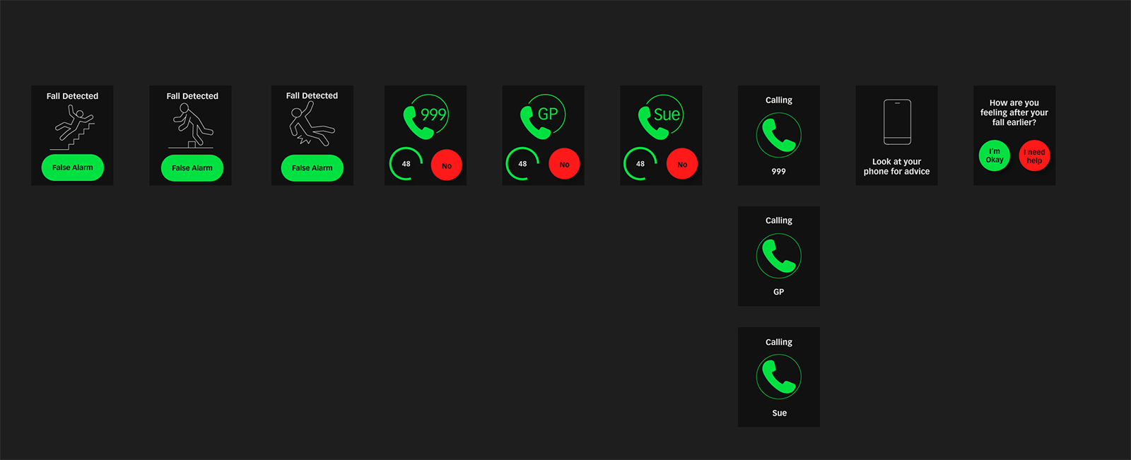
These are my final screens, and below my improved visual assets:
Feel free to have a look at my Figma File
Outcomes
I have created a full set of screen mockups for a fall detection app, these are now ready to be made into a prototype for user testing. Following iteration based on user testing I will have a final prototype that could be handed over to an enginneering team to build.
As this is a university project, I will submit my final prototype for marking as one of three projects completed in semester one of the 2023/2024 academic year. I believe that this project meets the brief given and I hope to receive a high mark for this project.
Lessons
I take forward a number of lessons from this project, the first is clear, always check the colour contrast between foreground (or text) and background colours. This is non-negotiable and all my work must meet accessibility guidelines if not be even better.
I also learnt a lot about how to design effectively for both the limited screen space available on a smartwatch as well as the design considerations required when designing for an older age demographic. I believe this will stand me in good stead when designing in the future.
I was happy with my design process for this app, especially given the tight timescale. If I would change anything it would be to ensure I double-checked my work, even when a project has a quick turnaround, it is key to get the basics correct before presenting my work. I feel I would have been able to get more varied feedback on my design during the design critique if I there had not been the obvious contrast issue.
For a much deeper insight into this project visit my Notion blog